
Recently, I attended a talk at Latinoware 2025, presented by Spacial (Jacson Querubin) about Buffer Stack Overflow. What caught my attention most was not just the content, but the format.
The slides had animations showing each processing step, which made learning much easier. I had studied this topic before and, honestly, it was painful; but with that methodology and interactivity, by the end of the talk I wanted to ask where he teaches so I could enroll. That was when it clicked: interactive content completely changes the learning experience.
I had already built two interactive slide decks using SVG + JavaScript (which takes a lot of work), and I had also struggled with animations in Keynote. But I had never stopped to study this approach in depth.
So I started researching and discovered a whole new world:
- Explorable Explanations
- InfoViz / DataViz
- Papers on teaching with interactive content
Here is my curated list of what I found, some of the best examples of how to do this really well.
From now on, my articles will follow this style. In fact, this is why I updated my whole blog stack: to componentize interactive elements and reuse them in other posts.
Polo Club of Data Science (Georgia Tech)
![]()
The Polo Club of Data Science, from Georgia Tech, publishes amazing interactive articles and tools in areas like:
- LLM visualization
- Deep learning interpretation
- Large graph visualization
- Cybersecurity
- Human-centered AI
They build scalable and interactive tools to explore models and data at scale. If you like visualization applied to AI, this is a gold mine.
Sam Who — Big O done right

- https://samwho.dev/
- Big O: https://samwho.dev/big-o
- Load Balancing: https://samwho.dev/load-balancing
Just like Spacial made me enjoy Buffer Stack topics, Sam was the first person who made me enjoy reading about Big O. Until then, I disliked these subjects because they felt too hard to absorb.
One important detail: I recently discovered that I learn very well through visual memory, which aligns perfectly with interactive content. It is much easier for me to absorb knowledge this way.
I always thought these topics were boring and too abstract. But his animations showing algorithm growth in practice, comparing each case visually, made it genuinely enjoyable to learn.
His Load Balancing article is also excellent: visual, intuitive, and direct.
If you have ever run away from asymptotic complexity, try again here.
NaNda (Not a Number)


- https://www.nan.fyi/
- Interactive SVG course: https://www.svg-animations.how/
- Sliding Window playground: https://visualizer-sepia.vercel.app/patterns/sliding-window/find-all-averages
Nanda has a wonderful interactive blog about:
- Databases
- Arrays
- Data structures
- SVG
She also built a fully interactive SVG animation course. I have not taken it yet, but it is on my list.
Besides that, she has a very cool visual challenge project for iteration patterns (like Sliding Window). It feels like learning by playing.
Distill — Interactivity with academic depth


- https://distill.pub/
- Interactive communication: https://distill.pub/2020/communicating-with-interactive-articles/
Distill was a more academic editorial project focused on Machine Learning and Data Science, with one huge differentiator: interactive articles as the default.
They even have a specific study on how to communicate ideas through interactivity, blending education, journalism, and visualization.
They also used to have a funding program for interactive articles. (Please bring that back 🥲)
Here is a provocation: What if there were a conference where speakers were paid to produce both the talk and an interactive article? We would likely see more content like this, and more people learning complex topics in a practical way.
Seeing Theory — Visual probability
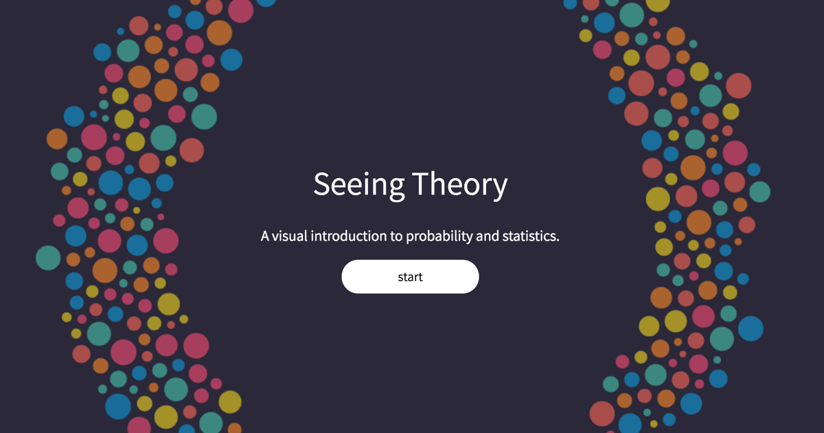
https://seeing-theory.brown.edu/
One of the best visual resources on Probability and Statistics.
Distributions, theorems, random variables, all explorable in the browser.
If statistics has ever been painful for you, this might be your turning point.
Mathigon — A math playground
Polygons, geometry, algebra, all in a playground format.
It is beautiful, interactive, and didactic. Learning math has rarely felt this visual.
Menstrual cycle visualization (Harvard)

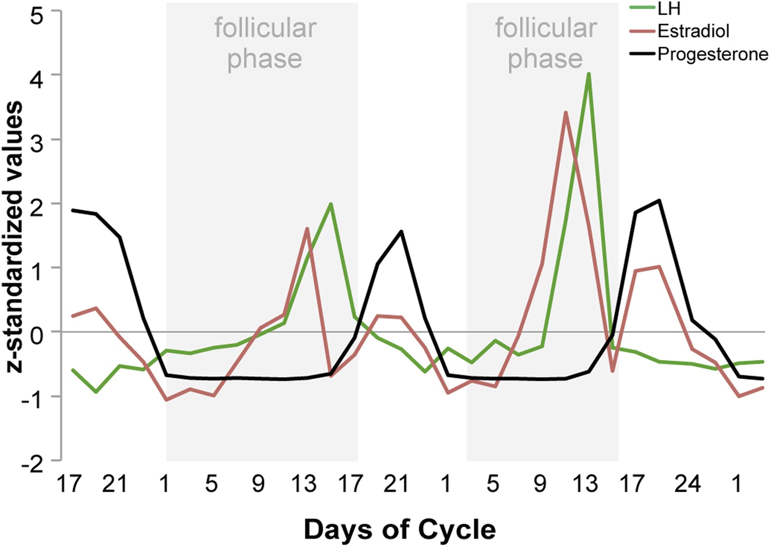
Interactive articles are not only for tech.
This visual study on menstrual cycle variability, connected to the Apple Women’s Health Study, uses visualization to explain complex medical concepts clearly.
It is a good chance to understand better something many people reduce to “just a minor pain.”
The Pudding — Data-driven journalism

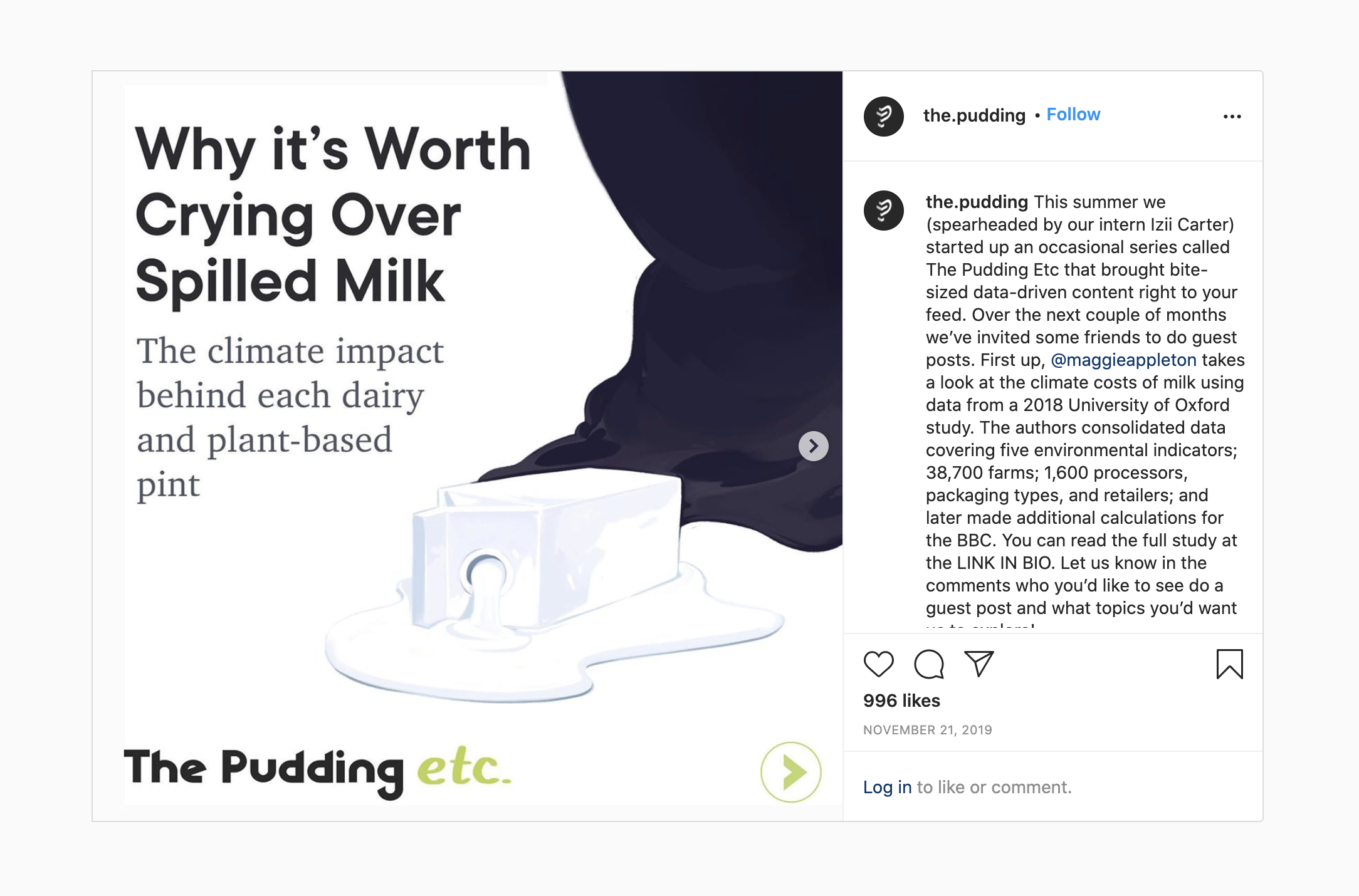
The Pudding explains ideas through visual essays based on data.
They have published pieces about:
- The best way to cut an onion
- The probability of dying on your birthday
- Foot pain
It is journalism + design + data + interactivity.
Learning Music — Ableton
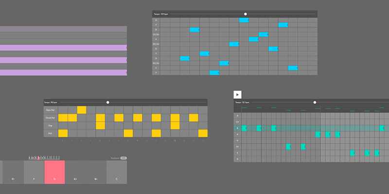
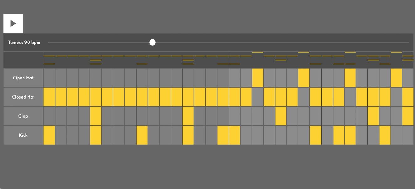
https://learningmusic.ableton.com/
For people who think music is a gift:
This interactive Ableton site teaches music fundamentals right in the browser. You can play with:
- Beats
- Harmony
- Melody
- Structure
I keep it bookmarked. Sometimes I open it just to play around.
Awesome Explorables (GitHub)
https://github.com/blob42/awesome-explorables
After discovering the terms Explorable Explanations, DataViz, and InfoViz, it became much easier to find this kind of material.
This repository is a curated list with dozens of great examples.
My experiments
Threat Modeling (in slides): https://guisso.dev/posts/threat-modeling-intro/
CI/CD security slides: https://guisso.dev/talks/cicdont
They are not as educational as the examples above yet, but they are already attempts to make content more explorable.
The best of all: Moon — Bartosz Ciechanowski


If there were a Nobel Prize for interactive articles, this guy would win.
His Moon explanation is simply outstanding: visual, animated, didactic, and deeply technical without being heavy.
And he has several other articles at the same level.
Conclusion
Explorable Explanations are not just “pretty articles with animations.”
They:
- Reduce cognitive load
- Turn abstraction into intuition
- Actively engage learners
- Make complex topics more accessible
After diving into all these examples, one thing became clear:
The future of technical education is interactive.